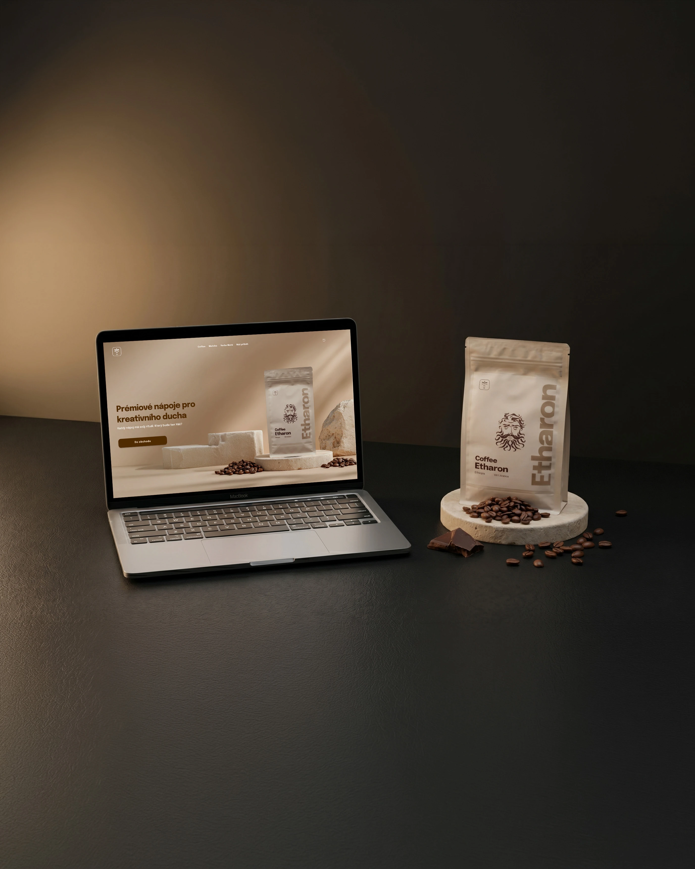
Herbal Gods is my own brand. A Czech premium beverage company offering specialty coffee, ceremonial matcha, and yerba maté.
The brand existed before but lacked direction. The identity was inconsistent, the product line unfocused, and the overall feel did not match the vision. A complete rebrand was needed. New direction, new identity, new story.
Everything was rebuilt from zero. This case study documents the full process.
The rebrand started with a single decision: commit to a clear direction.
We felt the name and logo were a strong start. What was missing was a world behind them. So we went all in on mythology. Each product needed its own god. A character with a purpose, a ritual, and a story. Before any design decisions were made, the entire brand mythology was written first.
From there, everything followed. The visual identity, the color system, the typography, the product naming, and finally the website.
Defining the new positioning, target audience, and the mythology that would unify the entire brand.
Logo refresh, color palette, typography, and visual guidelines.
Product stories, rituals, brand voice, and all website copy.
Full Shopify website including product pages, brand story, and e-commerce setup.
New positioning, mythology, and unified brand direction.
Logo, color palette, typography system, and visual guidelines.
Original mythology, god characters, product stories, rituals, and all website copy.
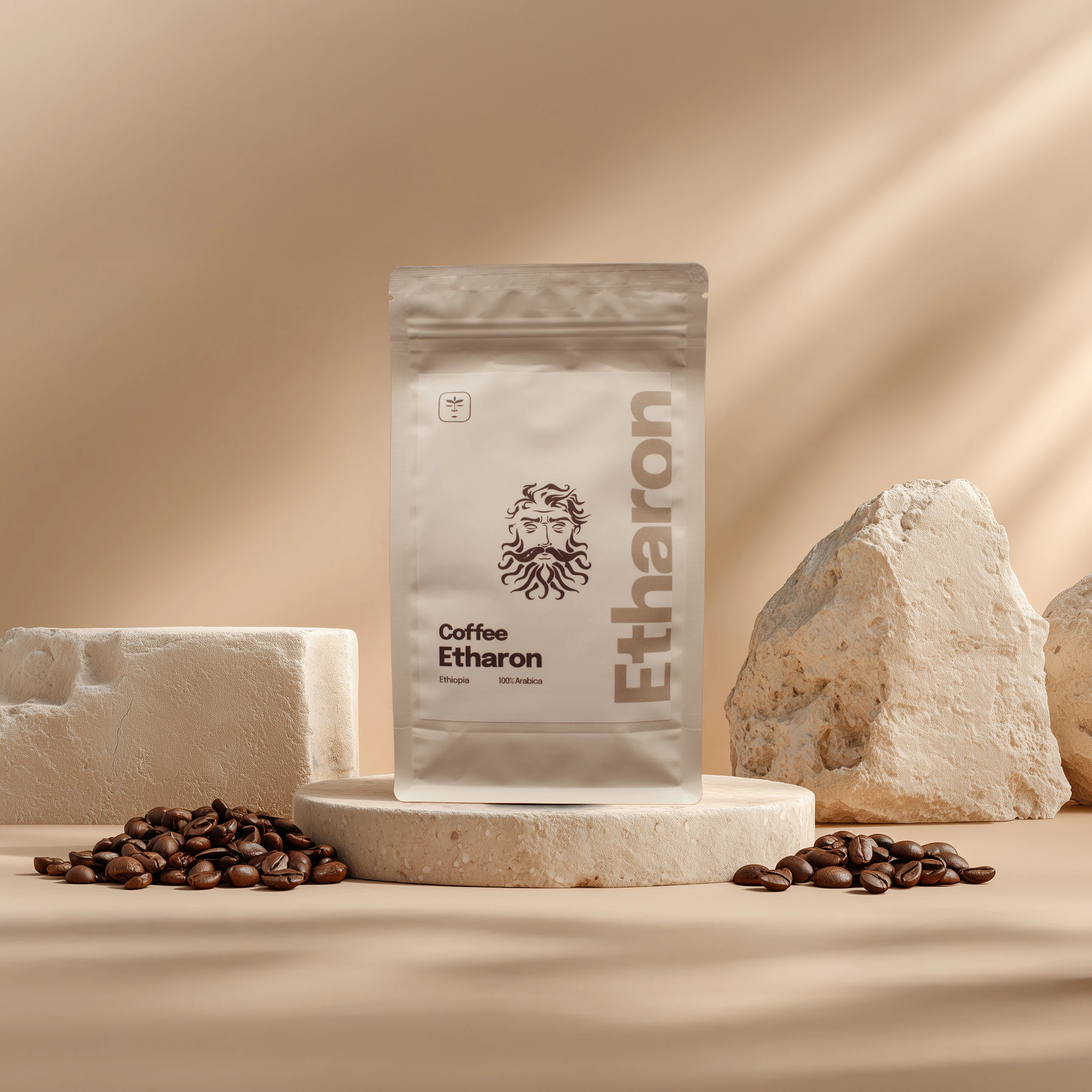
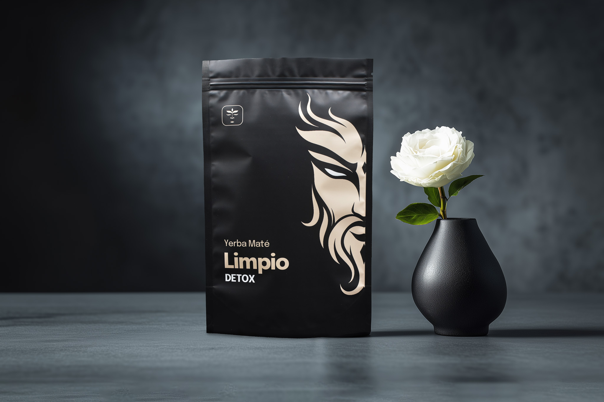
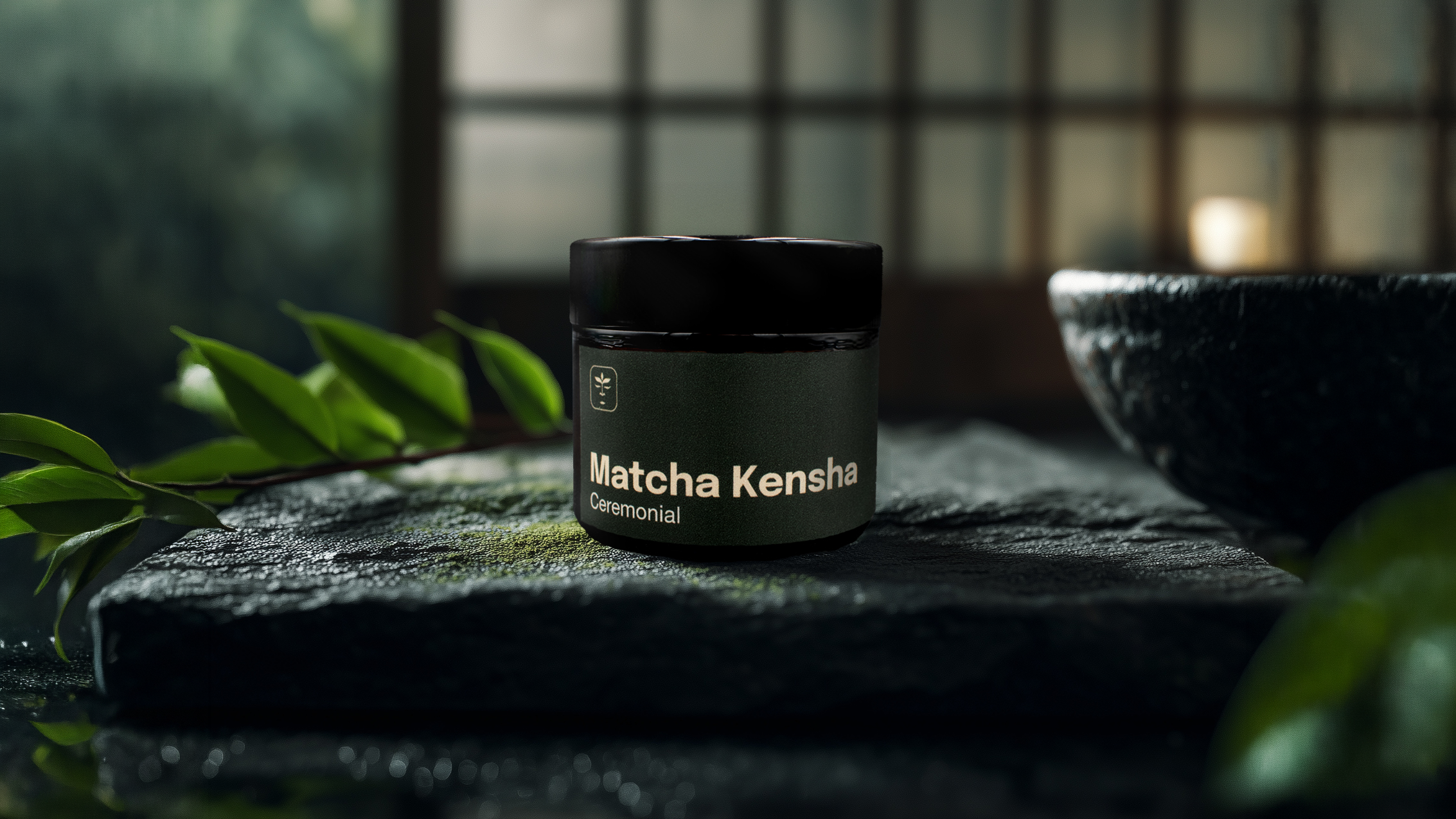
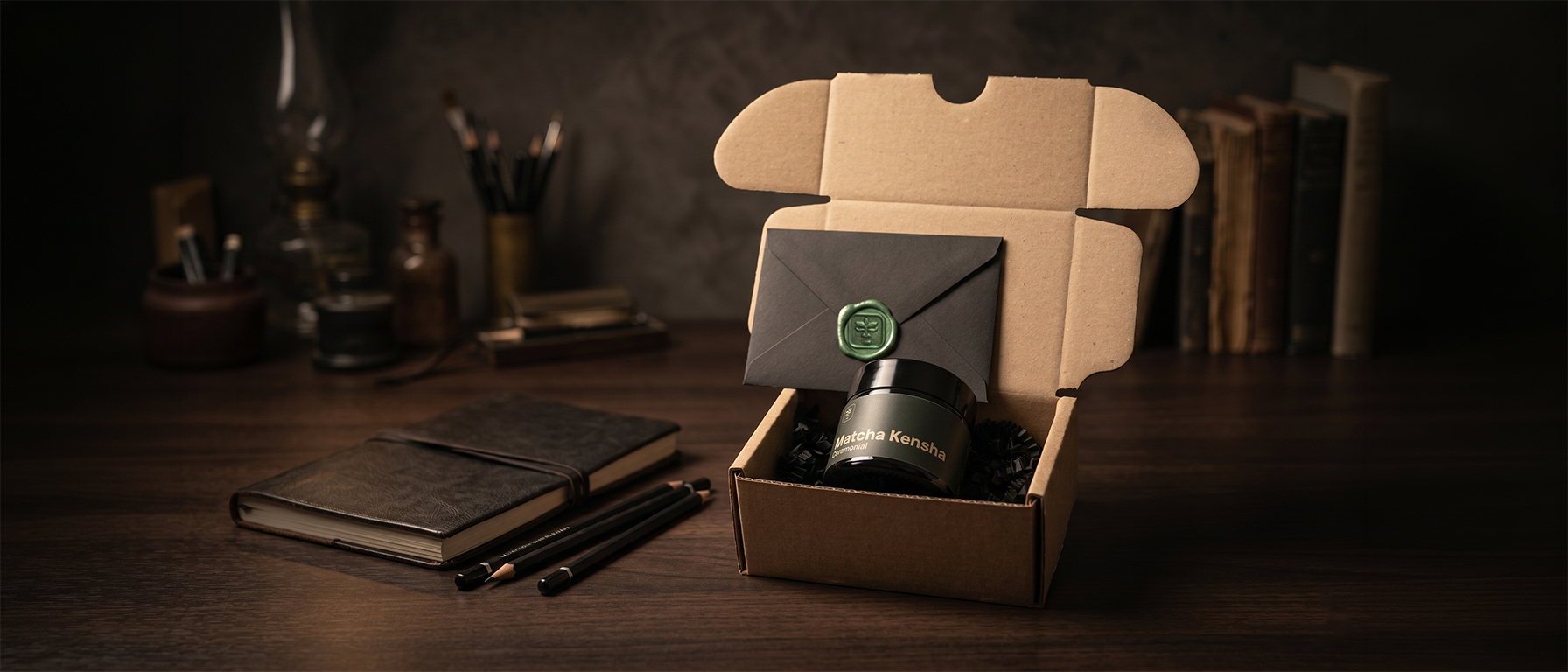
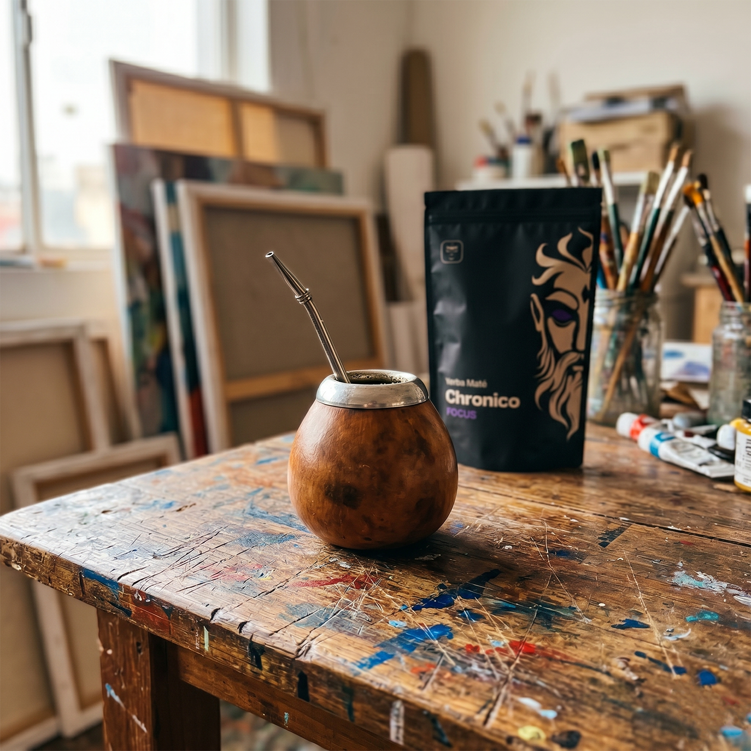
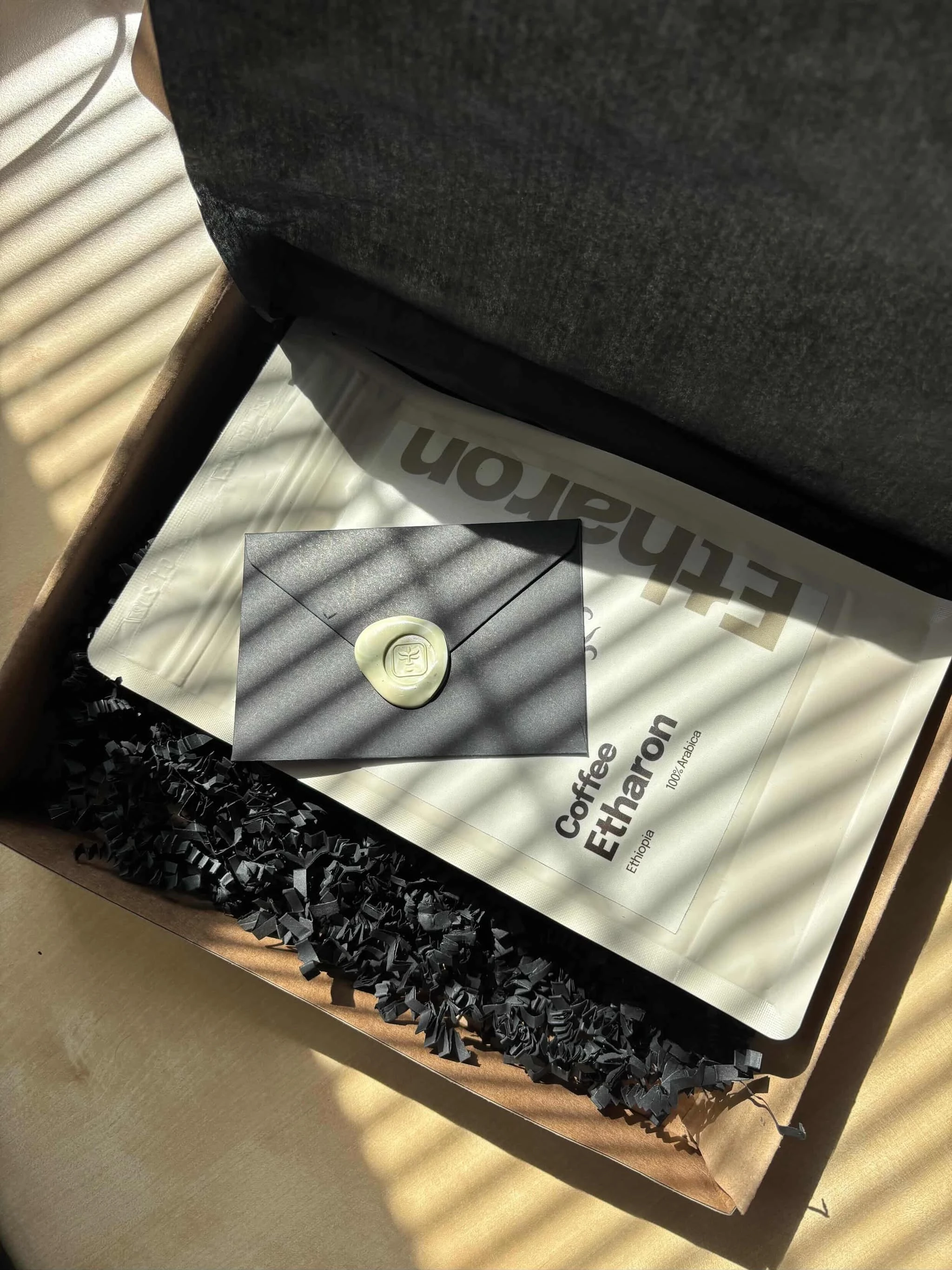
Premium and editorial across all product lines. Each category has its own color palette, creating a visual system that is consistent and instantly recognizable.
Full Shopify website including product pages, brand story, and checkout flow.
The rebrand is live. The brand has a clear direction, a unified identity, and a story worth telling.
Herbal Gods is no longer just a beverage company. It is a mythology. Each product has a god, a ritual, and a purpose. The brand speaks to a specific audience with a specific message.
Results are being tracked. This section will be updated as data comes in.